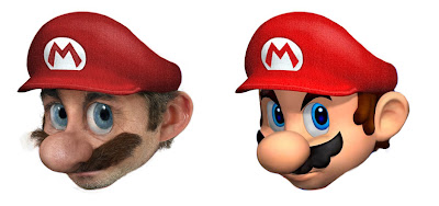
For those curious ones here is the render i found online that i based the Mario image off of:
As you can see, the hat texture was the part that i kinda got lazy on. :) I didn't save any of the reference pictures I got the textures from but I was able to track this one down again, I used a bunch from this photo I found from a costume store online:
Mainly around the ears, some from under the eyes. The stubble on the chin was from a picture of John McEnroe and the nose texture was from some old guy, i forget where.
So yeah, basically this is just glorified cutting and pasting :) I admit it.
skip to main |
skip to sidebar
who i am
Just having some fun. I do a lot of Photoshop work for a living both illustrations and image manipulation. This blog is my outlet.
Thank you all for the support and i hope you continue to enjoy this along with me.
To leave me a comment please add comments to any post. For anything else you can email me at:
jaxpixeloo (at) gmail (dot) com

Thank you all for the support and i hope you continue to enjoy this along with me.
To leave me a comment please add comments to any post. For anything else you can email me at:
jaxpixeloo (at) gmail (dot) com


28 comments:
Don't put your shit down as just glorified copy and pasting. That shit looks 100% professional. It takes time and dedication to copy and paste as good as you did to make that Mario face. It's bloody awesome. Creepy...but awesome! Nintendo need to hit you up and work that in an ad campaign.
Great stuff! :D
I cannot WAIT to see your Homer Simpson...
I also think that you should get money and fame out of this talent you have. good luck and good job!
Very cool
For a second, I thought that dude in the moustache was supposed to be the "Homer"
Phew!
PS: Where the hell is HOMER?!?!?! :)
great work man.
Hey it's glorified copying and pasting as much as the work of the great masters is glorified moving some pigment around on a canvas with a brush!
It's the creativity and vision that make it awesome :)
Hello, congrats on the image. It's really amazing. I'm a videogame journalist, and my magazine would like to use your image of Super Mario. I found no other way to contact you, so could you please email me at gnmbrito at yahoo dot com? Or post an email we can contact you to, please. It's kinda urgent also. Again, congratz. Thnx :)
Gonçalo Brito
Hello 'Pixeloo',
I can't find an email address anywhere, so please contact me at rfr_st AT yahoo DOT com , I have a business proposal for you. This is 100% serious, trust me.
Thanks, looking to your email.
Still takes talent and still looks cool... don't down yourself bro. Keep 'em coming.
10 bucks says that the "real" Homer Simpson will give me nightmares.
I am still amazed at how awesome your picture is. If you could do Luigi and Mario together that would be one of the coolest pictures ever! I like the detail in Mario's stubble and he looks older once you've added the wrinkles around his eyes...lol
That is a true Italian Plumber right there!!!
This blogspot may have recently started, but when you have art this amazing word spreads fast. I already told all of my friends about this picture and I heard about it through a friend.
Keep up the good work man. Excellent!
excellent ! bravo !
Mario was really creepy.
But if you make a 3D verision of this obscure cartoon character, I'd get a "kreepy" kick out if it:
http://bp1.blogger.com/_iugexeWqLbs/Rn16FlqU-BI/AAAAAAAAA58/8D91fIOxr1s/s1600-h/PDVD_268.jpg
very nice,
Rubia Melo, BRAZIL
Nice... already getting business offers.
"So yeah, basically this is just glorified cutting and pasting :) I admit it." And yet we still love you. This is still skill, no matter how you cut it.(pun intended.
Even as copy pasting that looks great, it's not much different than what I would do when making a texture map for a model but mine don't usually look that nice heh, might be my sucky models doing that though.
freegamedesigner.blogspot.com
this is really really great! i love it!
Mario looks great. Not that i can do better, trust me I'm not complaining but if I had to criticize a few things, besides as you pointed out, the hat... I'd have to say that the eyes are off somehow. It looks composited in a different layer, so the lighting isn't quite right. Other than that, Mario just looks old and sad. Why all the gray hair and wrinkles? Keep up the great work, the Homer you did was incredible!
The cartoon looks more determined. I think it's the pointy eyebrows. You're already a semi-legend for this, keep it up!
Suggestion:
Peter from family guy
I like this mario actually quite a bit. It's better than your Homer. The Homer one feels a bit strange to me. Mario just looks a bit too much like a keebler elf. I think mario shouldn't have stubble though. Everything else is good on this one.
Feel free to check out my blog. I just started on blogspot. Just random thoughts for content
keep up the good work
Looks great, bou I think you should shave him a little :)
wow you are good!
I wondering if you could send me a high-res version for printing?
I want that in my room.
It looks great!
isn's that picture from kingkong?
your so pretty awesome men.. (^_^), the best digital artist i've known so far.. (^_^) you'll be my inspiration in making arts (^_^)
You should make a life like game!
Post a Comment